Client | BAHT British Association of Hand Therapists
Perception were commissioned to create a new logo and identity for the British Association of Hand Therapists (BAHT). With a membership comprising physiotherapists and occupational therapists, BAHT is a registered UK charity and clinical interest group for the rehabilitation of hands. BAHT aims to support members in their professional development as hand therapists, including the progression of specialist knowledge, clinical skills and their understanding of the profession.
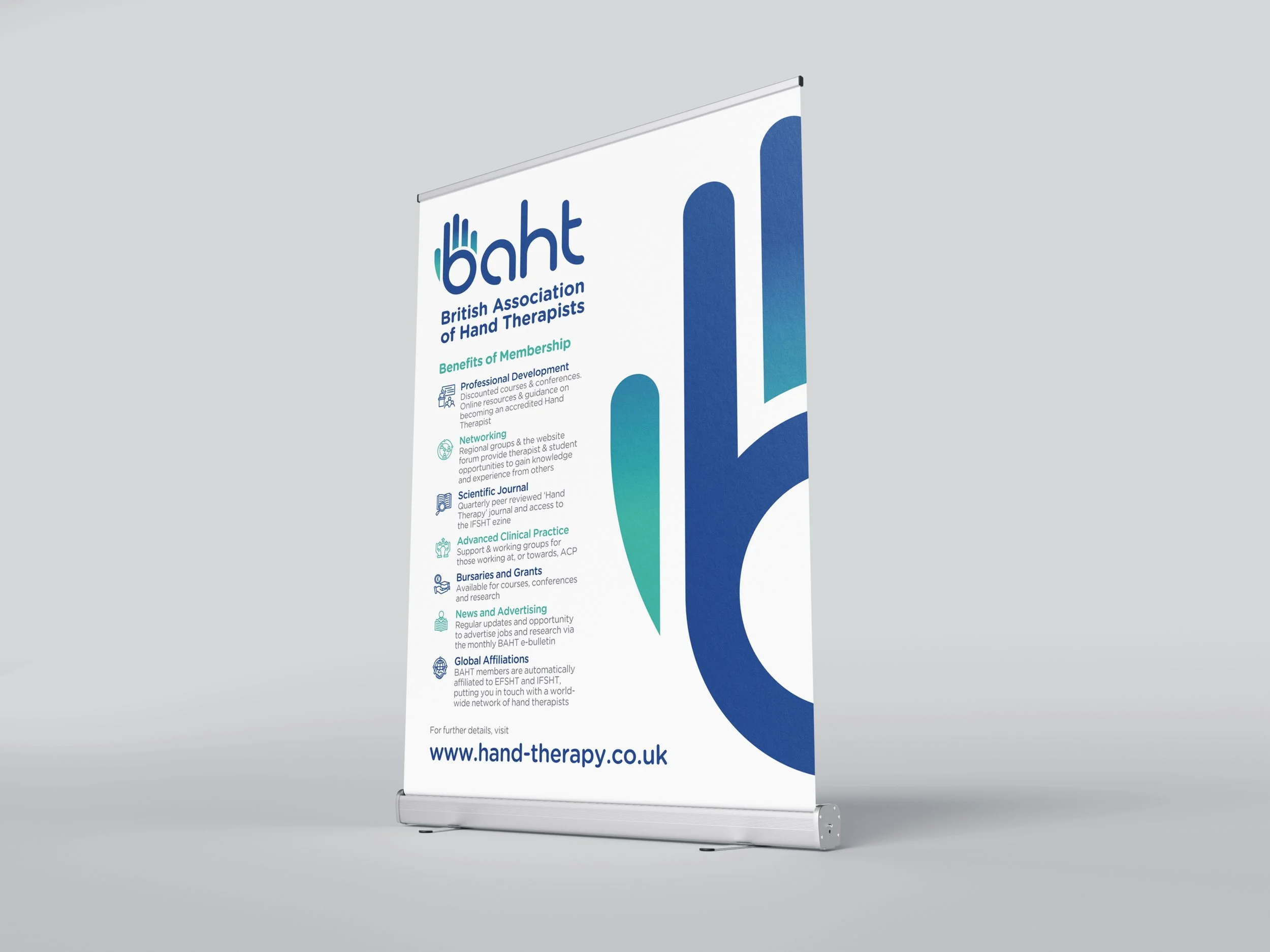
Wide format banner stand designed to launch new identity at BAHT’s annual conference
The new logo was designed to update BAHT’s visual identity, its signature hand / “b” letterform pairing the dark blue and teal colours traditionally associated with physiotherapists and occupational therapists. A bespoke logotype was also created for the remaining three letters of the acronym, with the intention that the iconic “b” graphic could be used as a standalone mark, or as part of the complete logo.
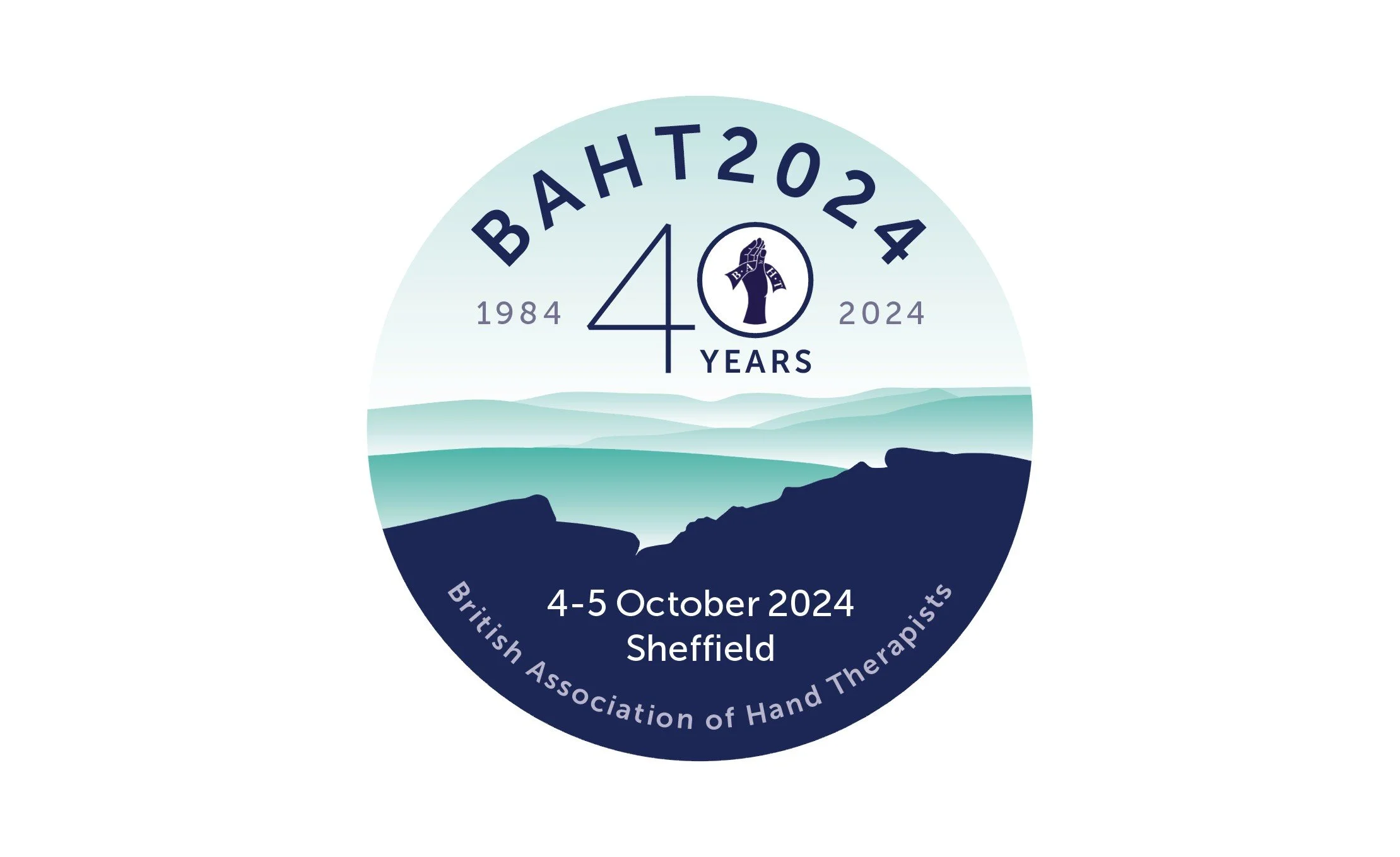
Identity for BAHT 2024 conference in Sheffield
Perception’s first involvement with BAHT came in the form of an identity for the organisation’s annual conference. Held in a different UK location each year, the 2024 event was hosted in Sheffield, and BAHT’s committee were keen to create an identity that reflected the locale as well as highlighting the organisation’s 40th anniversary. Again combining the signature teal and dark blue colours associated with the membership’s core groups, the conference logo evoked the scenery of the nearby Peak District national park.


